
BRAND AND CORPORATE IDENTITY · TOURISM AND TRAVEL
Oves Tourism
Tourism and travel · 4 applications
Oves Tourism images
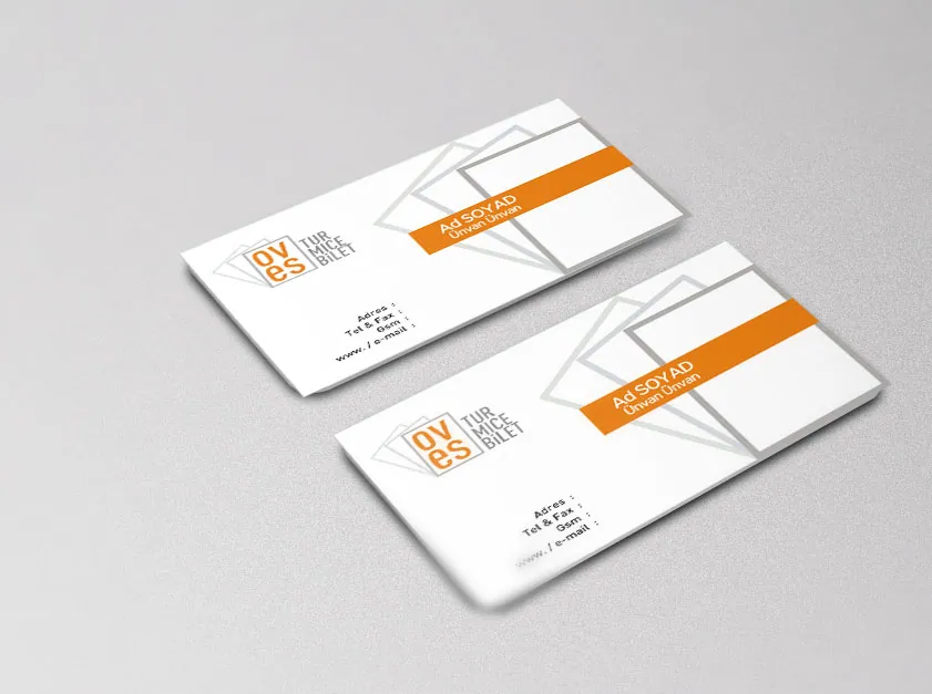
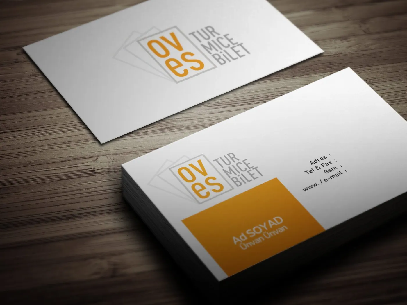
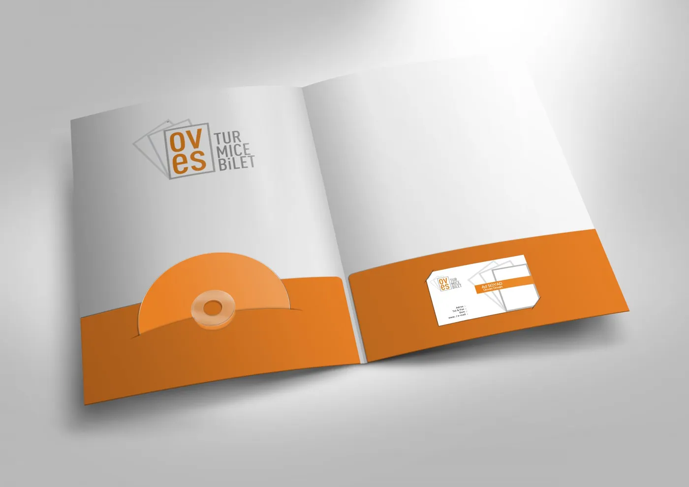
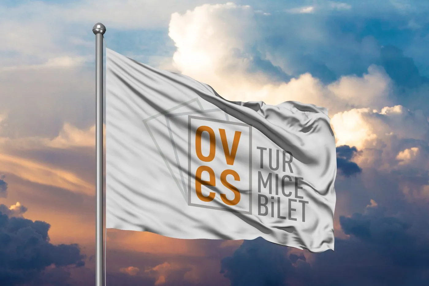
The work for Oves Tourism built a typographic, restrained identity in place of the photography-heavy language common in travel. Visual clutter dates quickly in tourism brands, while a simple mark stays constant even as seasonal campaign imagery changes.
The work covered the logo, business cards, corporate colour system and stationery templates. An orange band was used as a shared layout element across every application from card to letterhead, making different documents look like members of one family.
Details
- Sector: Tourism and travel
- Category: Brand and Corporate Identity
- Output: 4 application images
- Practice: Corporate identity
Deliverables
- Logo and mark
- Business cards
- Corporate colour system
- Stationery templates


04FAQ
Frequently asked questions
What was produced in the Oves Tourism project?
Production covered 4 headings: logo and mark, business cards, corporate colour system, stationery templates. The full output is documented on this page with 4 application images.
What need did the Oves Tourism project start from?
The starting point was the logo and mark requirement of an organisation working in tourism and travel. Scope then widened as far as stationery templates, with every heading tied into a single brand and corporate identity system.
Which practice does the Oves Tourism project belong to?
The work ran under Corporate identity and was produced by the Marka Studio practice, which continues today as Avenra's Creative, Brand & Digital unit. Similar requests in tourism and travel are met by the same team.
→Let's beginWork like Oves Tourism
Work like Oves Tourism
is possible for you too.
Describe your problem and we will set scope and timing together in the diagnosis call.