
Artpans
Architectural metal panel systems · 2 applications
Artpans images
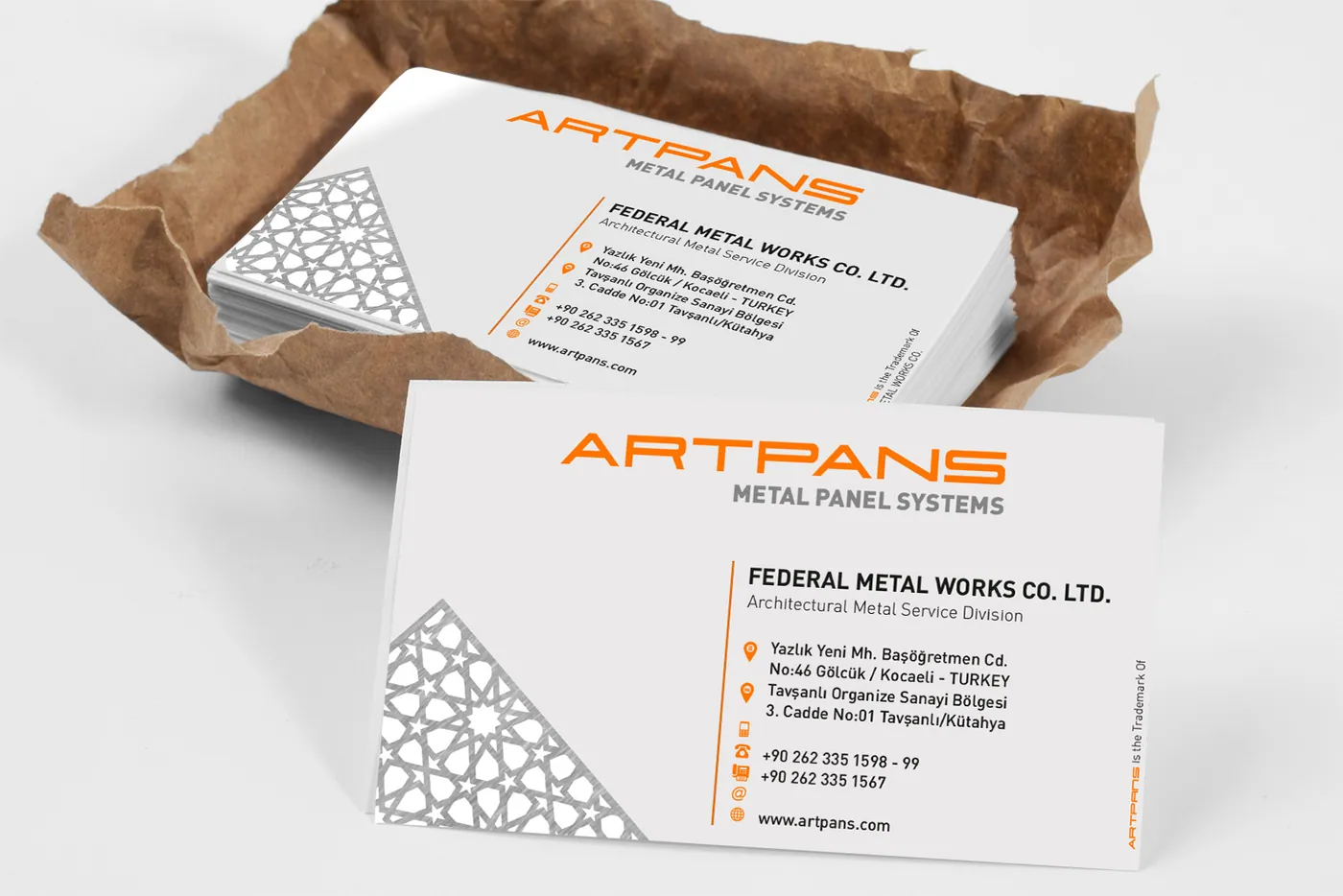
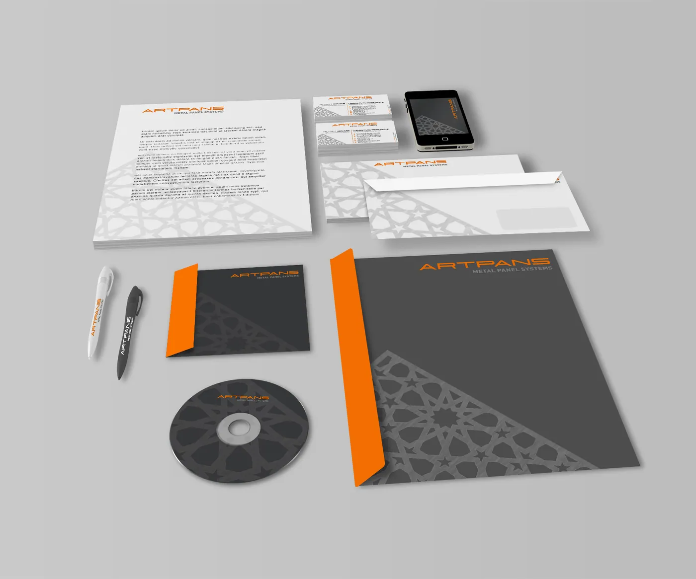
Artpans manufactures architectural metal panel systems. The visual language of the category comes straight from the product: perforated and patterned metal surfaces. Those surfaces were turned into a pattern system and made the brand's secondary signature, so a brand signal can be produced across large areas without enlarging the logo.
The work covered the logo, pattern system, business cards and corporate colour system. Orange was chosen to separate the brand against grey metal surfaces, and the balance of pattern and plain area on the card was built as an example of how the same logic carries into large-scale facade application.
Details
- Sector: Architectural metal panel systems
- Category: Brand and Corporate Identity
- Output: 2 application images
- Practice: Corporate identity
Deliverables
- Logo and pattern system
- Business cards
- Corporate colour system


Frequently asked questions
What was produced in the Artpans project?
What need did the Artpans project start from?
Which practice does the Artpans project belong to?
Work like Artpans
is possible for you too.
Describe your problem and we will set scope and timing together in the diagnosis call.