
BRAND AND CORPORATE IDENTITY · INDUSTRIAL ALUMINIUM SYSTEMS
Alumasys
Industrial aluminium systems · 2 applications
Alumasys images
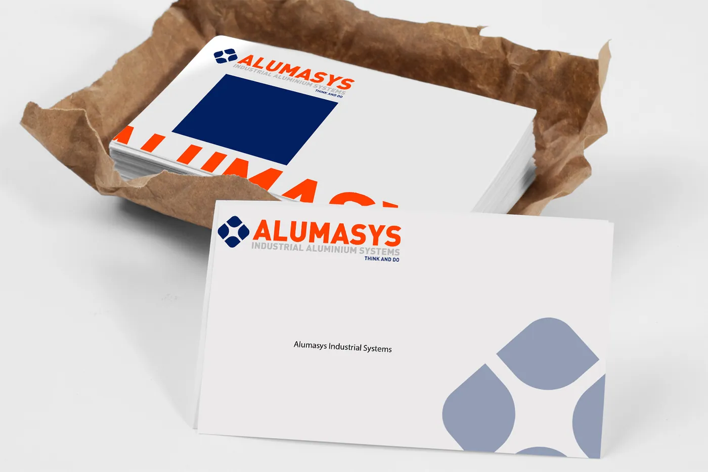
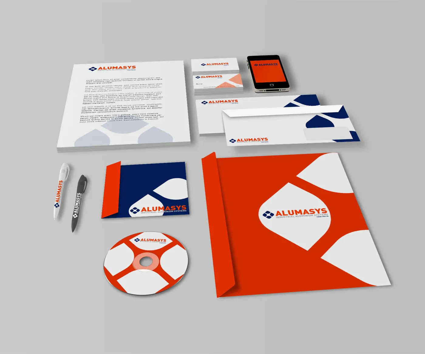
The mark designed for Alumasys represents the joining logic of aluminium systems through a three-part module form. In industrial aluminium the brand difference usually cannot be told through the product itself, so the mark was built as a symbol that abstracts the manufacturing logic instead.
The work covered the logo, business cards and corporate colour system. The navy and orange combination lets an export-focused company look both serious and distinct in international trade fair environments, while a watermark use of the mark on the card produced a secondary texture layer.
Details
- Sector: Industrial aluminium systems
- Category: Brand and Corporate Identity
- Output: 2 application images
- Practice: Corporate identity
Deliverables
- Logo and mark
- Business cards
- Corporate colour system


04FAQ
Frequently asked questions
What was produced in the Alumasys project?
Production covered 3 headings: logo and mark, business cards, corporate colour system. The full output is documented on this page with 2 application images.
What need did the Alumasys project start from?
The starting point was the logo and mark requirement of an organisation working in industrial aluminium systems. Scope then widened as far as corporate colour system, with every heading tied into a single brand and corporate identity system.
Which practice does the Alumasys project belong to?
The work ran under Corporate identity and was produced by the Marka Studio practice, which continues today as Avenra's Creative, Brand & Digital unit. Similar requests in industrial aluminium systems are met by the same team.
→Let's beginWork like Alumasys
Work like Alumasys
is possible for you too.
Describe your problem and we will set scope and timing together in the diagnosis call.